

If you’re planning a wedding, you’ll want to get on top of the latest wedding colour trends. We’ve rounded up the most popular wedding colours for 2023 weddings, so you can choose the right hues for your big day!

The timeless colors of ivory, champagne, and white continue to be popular choices among to-be-weds. These neutral shades look stunning as-is or paired with other colors to create your perfect palette.
Color Wheel
When it comes to designing a wedding, color is one of the most important elements. You want your palette to feel cohesive and flow nicely without feeling too limiting. However, picking the right colors can be a tricky process.
The first step is to gather inspiration from a variety of sources. You can look at colors you’re drawn to in your everyday life, including fashion, home decor, and other personal items. Then, try to find out the meaning behind those colors.

For example, pink is typically associated with femininity, while yellow is often associated with joy. These two colors can be used together in your wedding color palette to add a touch of romance and happiness to your special day.
Another great way to gather color inspiration is to check out the Pantone Color of the Year, which is released every year to predict future trends and provide designers with a set of hues they can use for their work. You can also check out the website’s wedding colors section to see a wide range of ideas.
You can also use the color wheel to help you narrow down your palette. A color wheel shows which colors pair well with each other, and can be a helpful tool when choosing your colors for your big day.
To create a wedding color palette, you’ll need to choose a few primary colors and a variety of complimentary and analogous colors. These are colors that lie directly next to each other on the color wheel and tend to match well with each other.
Then, you’ll need to figure out which of those colors should be the primary and which ones should be the complements or accents. To do this, you can use the color wheel to see which colors go well with each other and which ones should be avoided.
If you’re looking for a more traditional wedding, go for a white or ivory color scheme. This will give you a clean, elegant look that’s sure to be memorable for your guests. Alternatively, you can choose a soft palette of pastel colors to add an airy feel to your wedding.
Drawing Inspiration
Choosing the perfect color palette for your wedding is one of the most important things you will do during your planning process. It will help you create the look you have always dreamed of for your special day and make all the details come together.
A great way to get started is by drawing inspiration from your favorite things. Whether it’s a beautiful landscape painting or a photo of architectural detail, find something that speaks to you and pin it onto your wedding inspiration board. You can even print out a copy of the image and keep it in your wedding book.
If you’re not sure what colors would work best for your special day, try looking at other people’s wedding photos. You may discover a color palette that you’re immediately drawn to.
When picking colors for your wedding, it’s also important to consider what the shades mean to you and your partner. For example, one couple may associate red with passion and drama while another might think of a vibrant hue that makes them feel energized and invigorated.
This can help you determine whether you want to incorporate bright, bold colors or muted, soft ones into your color scheme. It’s also a good idea to check the color wheel to ensure that you’re pairing colors in the correct balance.
You can also use the color wheel to see how the colors of your choice would pair up with other elements in your wedding design. For instance, if you have a lot of gold in your decor, you might consider using neutral colors such as brown or tan to counteract the brightness.
Alternatively, if you’re going for a more traditional palette, stick with recognizable choices like red, white, teal, and coral. These colors are timeless and can be paired with a variety of other colors for a unique look that fits your style.
Finally, if you’re still not sure what color scheme will best suit your wedding, consider browsing fashion blogs and interior design magazines. These are full of creative ideas and will help you get a better understanding of how different shades can be used to create unique looks.
Wedding Color Combination
When it comes to wedding color palettes, the key is to choose a combination of colors that work together and are complementary. This can be tricky, especially when you have a number of ideas to consider. However, it can be helpful to use a variety of color-choosing apps or websites that allow you to find and compare wedding photos and color schemes from thousands of other brides and grooms.
For example, you can use Pinterest to sift through photos and colors from real-life weddings to help you determine which color combos will work best for your own style. Or, you can consult with a friend or family member who knows you well and may have more insight on what you should include in your wedding colors.
Using a color wheel to determine which colors complement each other is a great starting point for planning your wedding color palettes. By looking at the color wheel, you can get a feel for the overall mood you want to create.
Then, you can look at the different ways you can incorporate these colors into your wedding. You can use a mix of neutral tones or opt for bold colors.
You can also try incorporating elements from your venue or season of the year into your colors. For instance, if you’re getting married in the spring, you can use soft rosy pinks and bright coral tones as your primary colors.
If you’re a fan of the darker side of the spectrum, you can try a deep jewel tone for your main colors. This can make your wedding feel elegant and sophisticated. If you want to elevate the look even more, pair a lighter shade of this hue with silk or velvet fabrics for accents like your bouquet stems and tablecloths.
This is a classic, elegant, and classic-vintage wedding color scheme that looks stunning no matter the time of year. From vintage lace and crystals to arches of blush flowers, this palette is a true beauty.
This palette is a perfect choice for a rustic barn or a farm-style ceremony followed by a cozy reception venue. The colors are warm and welcoming and make guests feel at home and comfortable.
Here are some of the popular wedding colors:
Navy Blue


Navy blue is a classic wedding colour that never goes out of style. It is one of the most versatile colors and looks great with almost any color palette.
This timeless shade is a popular choice for couples who want to have a classic and sophisticated wedding, but also don’t want to be too boring. In fact, it was chosen by 27% of couples in 2022.
The dark blue tones of this shade can make a bold statement, especially when combined with other rich and vibrant hues like burgundy or deep purple. They also work well with light pastel tones, like blush pink.
Moreover, this color is extremely flattering in many complexion tones, making it a popular choice for brides and bridesmaids. The combination works beautifully in both indoor and outdoor venues.
Another popular wedding colour is terracotta or burnt orange. These colors are a gorgeous contrast to the navy blue background and can create an unforgettable wedding look. The combination is also a perfect choice for a fall or winter wedding.
Emerald Green

Emerald green is a luminous jewel tone that can be used in almost any part of your wedding, from the bridesmaids’ dresses and groom’s ties to the floral arrangements and table settings. This enchanting color is an extremely popular choice for spring and summer weddings–it’s a beautiful way to add a touch of vibrancy and charm to your special day!
In addition to its gorgeous visual impact, emerald green is deeply soothing and restorative. Pair it with crisp white for an incredibly luxurious look that feels clean, bright, and airy.
Another color that pairs well with emerald green is navy blue. It’s a classic color combination that’s perfect for any wedding, from an earthy rustic celebration to a glam winter wonderland celebration.
Lastly, burgundy and emerald green are a great combination that looks elegant and stylish. It also has the added benefit of complementing each other in terms of warmth versus coolness (black has more warmth, while green has more coolness).
The most important thing to remember when choosing the right colors for your wedding is to choose a palette that balances your main theme with complementary accents. This will ensure that your main theme stands out while still giving your wedding an overall cohesive feel.
Blush Pink
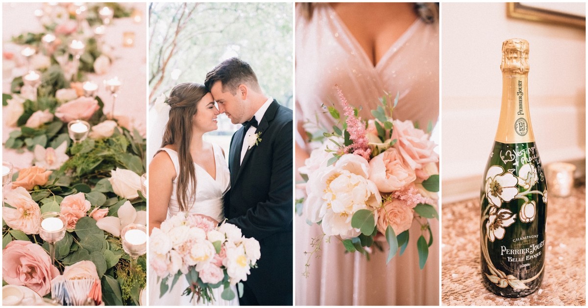
Blush pink is one of the popular wedding colours and it’s easy to see why. It’s a gentle and elegant color that works well with many different wedding themes and decor choices.
It’s also a popular option for spring and summer weddings. Pair it with sage green, dusty blue, or other shades of pink for a feminine look that’s sure to impress your guests!
Another option for a spring wedding is a soft yellow. This soft color complements a variety of other colors and is especially stunning with floral arrangements.
If you’re looking for a more sophisticated wedding color, consider mauve. This soft purple-pink shade pairs perfectly with blush pink and works well with other pastels as well.
This is an excellent choice for a spring wedding because it’s a beautiful alternative to peach or bright yellow. It’s also a great option for an indoor or outdoor venue.
In addition to adding blush pink to your wedding flowers and table linens, you can also make a subtle nod to the colour with blush pink bridesmaid dresses. These can be a great option for girls with lighter skin tones as they are a delicate hue that doesn’t overpower the rest of the wedding.
Dusty Blue

Blue is one of the popular wedding colours because it exudes elegance & romance. The color is also versatile, so it can be used in any season.
Dusty blue is a soft, romantic shade of blue that looks gorgeous on most skin tones. It pairs exceptionally well with other colors, including ivory and peach.
You can incorporate color into your bridesmaid dresses, floral arrangements, and table decorations. You can also wear a blue dress for your ceremony or reception, and choose light blue shoes and accessories to complement it.
To make the color stand out even more, consider using blue lace for your wedding invitations and envelopes. It will help you match your wedding theme perfectly!
The cool & calming tones of dusty blue work beautifully with bright shades of yellow, creating a fun & cheery ambiance that’s sure to leave your guests feeling happy and excited. The contrasting hues create a stylish palette that’s perfect for any season!
Burnt Orange

Burnt orange is a popular wedding colour that works well with a variety of other colours. It’s also a great choice for fall-themed weddings.
This shade can be combined with other autumn colors, such as burgundy or butter yellow, and can also work well with natural elements of the season like pumpkins. You can use this color on your cake, your bridesmaid dresses, your flower bouquets, and your table decor.
Another color that works perfectly with burnt orange is teal. This combination is a beautiful contrast that matches the transition from summer to fall.
You can even pair this color with metallics to create an eye-catching tablescape! A teal tablecloth, burnt orange candles, and gold or rose gold flatware can make a spectacular setting for your dinner.
Lemon Yellow

One of the popular wedding colours is lemon yellow, which evokes warm sunshine and sunny days. This color is also great for a fall wedding, especially an October wedding, and can look stunning in any venue.
Regardless of the season, this hue looks good on almost every skin tone and is a fantastic choice for bridesmaid dresses and flower girl outfits. You can pair it with darker skin tones for a more classic, traditional look or mix and match with lighter bridesmaid dresses for a more bohemian style.
You can find lots of beautiful flowers in this color, including roses and hydrangeas. They all come in shades ranging from pale to deep and are versatile enough to suit any type of wedding theme or color scheme.
A bright summer wildflower bouquet is a great way to incorporate this color into your wedding. Add in custard yellow tulips, cream garden roses, and pretty daisies for a bohemian-inspired flower arrangement that is both romantic and beautiful. Then, top it off with greenery for a wild and free-spirited look that is sure to wow guests!
Dusty Rose

Dusty rose is a trendy and romantic shade of pink that can be used for a variety of wedding decor elements. It’s a soft and subtle color that pairs well with other colors, especially blue.
Blush and lavender are other popular colors for a wedding. These shades work beautifully with a variety of flowers, including peonies, ranunculus, and garden roses.
This color combination will make your guests feel like they’re in a fairytale. It also looks stunning when paired with a rustic, outdoor ceremony or venue.
Another popular color combo for a wedding is dusty rose and burgundy. This combination will create a stunning fall or winter wedding.
For an elegant and romantic look, you can combine this color with gold tones. This will give the mauve tablecloth a shimmering glow and create a dazzling, glamorous atmosphere.
Dusty rose is also a popular choice for bridesmaid dresses, groomsmen suits, and other accessories. You can find this shade of pink in a variety of different colors, so it’s easy to find something that will fit your style and taste.
Mint Green

Mint green is one of the most popular colours for weddings because it looks refreshing and delicate. It can be used in bridal looks, bridesmaid dresses, groom’s attire, and decor to create a cohesive and elegant wedding theme.
The best part about mint is that it can go well with almost any other color including white, yellow, pink, and blue. It can also be used to create a beautiful backdrop for the ceremony, table settings, and chair decor.
Another great color to use for spring and summer nuptials is peach. It pairs perfectly with light mint green and lighter tones of pale green, which are perfect for a soft and romantic theme.
If you’re looking for something that’s a bit more neutral, consider grey. This color is refreshing and calming, and it looks lovely with mint ties or bow ties on groomsmen and grey suits with white shirts.
If you want to show off your love for this color without going overboard, consider adding a few pops of it in small details. Spray painting centerpiece jars and cans mint green or covering tables with mint green linens are simple ways to do it!
Wedding Color Palettes for Every Season
Choosing the perfect colors for your wedding will set the tone for your big day and make your vision come to life. But, before you dive in, it’s important to consider the meaning behind the color, as each hue has its own psychological associations and cultural references.
For example, a red wedding may evoke passion and drama while a blue wedding may bring thoughts of whimsy. But, don’t forget to think about your partner and what they like when making your decisions!
Spring
Whether you’re planning your spring wedding or are just looking for color inspiration, there are plenty of options out there. It’s important to keep in mind that each season has its own vibes and associated colors, so make sure your wedding looks just as you envision it!
Pastel shades like sky blue, buttercup yellow, lilac, and peach are all classic spring wedding colors that are super romantic and feel like the perfect choice for this time of year. Use these bright hues in your invitations, bridesmaid dresses, table linens, and decor to give your wedding a fresh and youthful look.

If you’re looking for a more elegant wedding, dusty rose and lavender is two of the most popular spring colors. Pair this duo with a khaki or grey bridesmaid dress and green flowers to create a sophisticated color scheme that is just as lovely for a country garden ceremony as it would be for an art museum reception.
Another color combination that is always a classic is blush and green. This pairing works for just about any theme or venue, so it’s a great option for any type of bride and groom.
When you’re looking for a more dramatic spring color palette, you can opt for coral and teal. This duo is a favorite among brides because it’s so versatile, and it pairs well with other hues as well.
Lastly, a classic combination of pink and blue is also a popular option for spring. This combination is a favorite for many reasons, but it’s especially ideal for a garden or outdoor wedding.
Summer
The warmer months of the year bring a bounty of flowers in bloom, plenty of natural sunlight, and plenty of opportunities for wedding color palettes that celebrate these elements. Whether you’re planning a late spring or summer wedding, these popular palettes are sure to please guests.
Dusty rose is a classic neutral that’s always in style, but for an unexpected twist, opt for bright shades like vermillion to really make this pastel hue pop. Pair this shade with white, cream, or brown florals for a subtle yet striking summer theme that’s perfect at home in the great outdoors.

For a more sophisticated alternative, try navy blue. This darker, more masculine color option is ideal for a traditional summer nuptial, suggests wedding planner Sydney Wellington. Using navy blue and pink or orange for accents will give the palette a preppy feel.
These colors are also an easy way to add a touch of summer sunshine into your color scheme, so you can go for an all-out summertime soiree that will be fun and memorable for your guests. For an unexpected twist, try incorporating a few flecks of gold into your decor as well.
If a beachy vibe is in the cards, a combination of rusty red and burnt orange can be an elegant choice. These hues are perfect for a winery wedding or beach theme, and they’ll help elevate your cocktail hour.
Another easy way to create a summertime feel is by combining sunny yellow with playful pinks. The combination of these two hues is just as awe-inspiring in real life as it is in photos, so you can’t go wrong with this palette.
Fall
When you’re thinking about the colors for your fall wedding, there are a variety of options available. These include jewel tones, muted neutrals, and warm earth tone palettes.
Another favorite fall color is cranberry, which is the perfect hue to highlight the season’s fruits. It pairs beautifully with gold, Champagne, white, yellow, and florals. This color is also a good option for rustic fall weddings, as it adds a pop of color that feels surprisingly classy.

If you want to go with a fall wedding color palette that’s more sophisticated and sleek, consider navy blue. It’s a classic choice that goes with a wide variety of themes, from rustic to farmhouse to modern and sleek.
It also looks great paired with burgundy, metallic gold, grey, mint, and warmer pastel tones like peach and orange. You can even add a touch of black to this color scheme for a moody feel.
Then, you can add a bit of purple to this color palette to round out the look and make it more romantic. This color is a great choice for fall because it’s the opposite of red, so it’s a great way to add a pop of color without going overboard.
This palette of burgundy, dusty pink, and soft blue is another perfect color for autumn. It’s a romantic combination that works well for romantic-meets-organic fall weddings. Choose an autumn-inspired setting and incorporate whimsical details and wildflowers for a beautiful look that’s sure to wow your guests!
Winter
Winter colors are a fun and easy way to add a touch of the season to your big day. From icy blues to rich reds, there’s something for everyone.
The classic pairing of red and green is always a favorite for winter weddings, but don’t be afraid to mix it up a bit with other seasonal hues to create your dream palette. Deep reds, burgundy, and evergreens work well with snow-white and silver decorations, while midnight blue can make a striking accent color for your venue decor.

Another unexpected combo is a black, ivory, and tan winter color palette that gives your nuptials a more contemporary feel. It’s also an excellent option if you’re looking to keep your palette as neutral as possible, but add a hint of holiday cheer.
Purple and gray are both warm, feminine shades that work great for any time of year, but they’re especially popular in winter. If you’re going for a more relaxed winter look, choose these shades as your base and add pops of pink to complement the darker tones.
These neutrals pair perfectly with white and gold, giving your wedding a timeless appeal. They are also a versatile choice for winter weddings, as they can be used in both traditional and contemporary styles.
A soft peach-pink wedding dress pops against a barely-blue ice castle backdrop, but you don’t need a frozen venue to get the look. Just add in some blush faux-fur shrugs and antlers for a wintery vibe that’s both romantic and cold-weather appropriate.
If you’re having a Christmas wedding, consider switching up the classic red and green with a slightly darker shade like burgundy or maroon. You can even add a pop of rose gold to give this color palette a touch of glitz and glamour.
If you’re looking for a more whimsical winter palette, consider picking up a few shades of sage or fern to compliment the deeper tones. These are perfect for rustic and nature-inspired weddings, as they’re soothing to the eye compared to darker palettes.
GIPHY App Key not set. Please check settings